Insight / News
Contact
Request a Call Back Today!
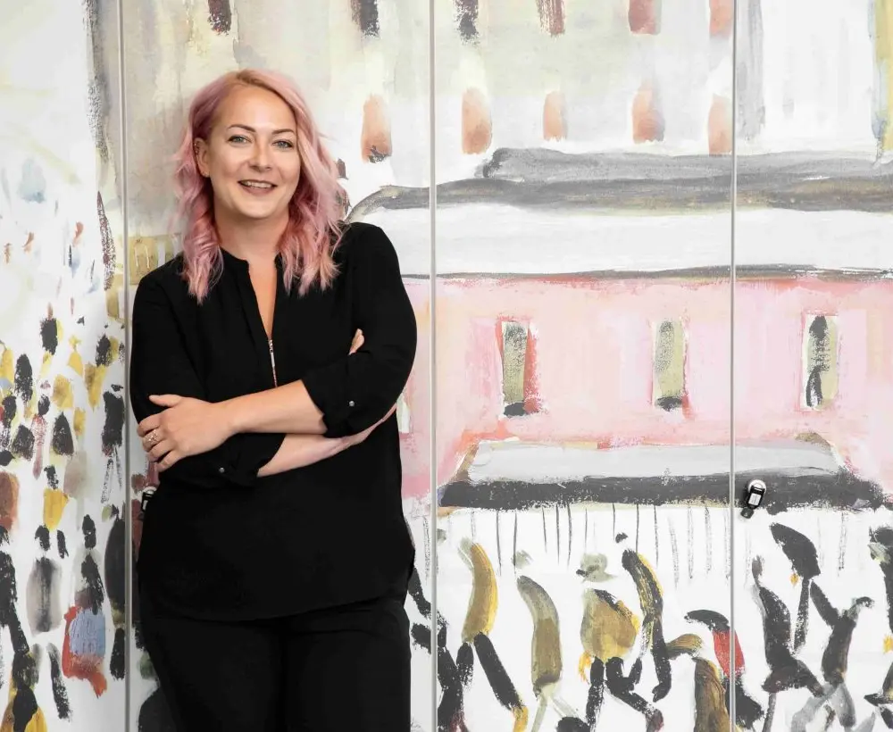
At OfficeInsight, everything we deliver starts with our people and Samantha is a brilliant example of that. She brings deep experience across workplace consultancy, interior design and Interior architecture, guiding clients through every step of their design journey to make sure they get the most out of their new space. Her project experience includes work with Evri, px Group and Northern Trust.
Here Samantha shares the trends she’s seeing across current briefs, and the projects that put them into practice.
I’ve lost count of the number of first-meeting briefs that open with some version of “we don’t really know what we need.” Hybrid working reshuffled the deck a few years ago, and most businesses are still working out what this looks like. Do you need more desks or fewer? Is the office even the right word for what you’re trying to build?
I don’t think there’s a single answer. But after another year of workshops, site visits and post-occupancy walkthroughs, some clear patterns have emerged in how the best workplaces are responding. Here are six themes I keep coming back to, with real projects to show how they play out once you get past the mood board.
1. Flexible layouts for a hybrid world
The old model of rows of desks, a bank of meeting rooms and one kitchen, was built for a workforce that was in five days a week doing broadly the same thing. That’s not the brief any more. We’re designing for people on video calls half the day, heads-down the other half, in for collaboration on specific days rather than out of habit.
That means a genuine spread of settings: quiet space for focused work and private calls, informal zones for spontaneous collaboration, bookable rooms for planned meetings, and social space that doesn’t feel like an afterthought. Just as important is designing for change, furniture that can be reconfigured, training and meeting spaces that can flex as a business grows, because whatever layout you land on today probably won’t be the layout you need in three years.
We saw this at Evri Head Office, where the brief was as much about variety as volume. Touchdown areas for people dropping in between meetings sit alongside formal hybrid meeting spaces built for a mix of in-room and remote attendees, and the restaurant does double duty as a break space and an informal working environment. None of it looks like a compromise, because it was designed for how people actually move through a day.
2. Nature and wellbeing, done properly
“Biophilic design” has become a bit of a buzzword, and I understand why people are wary of it, a few plants on a windowsill isn’t a wellbeing strategy. However done well, it’s about how daylight, planting, natural materials and acoustics work together.
Timber finishes and tactile fabrics change how a space feels to be in, not just how it looks in a photograph. Earthy palettes tend to be calmer to work in over a long day than high-contrast corporate colour schemes. And daylight and acoustics do more for comfort and concentration than almost anything else in the room, they’re just less photogenic, so they get less credit.
UCAS is a good example of this in practice. The design leans on natural finishes and planting, but the real work was in making the most of daylight through the building, orienting spaces so that light does as much of the work as possible, rather than relying on artificial lighting to compensate.
3. Inclusive and accessible design, as a starting point rather than an add-on
I used to hear “neuro-inclusive design” treated as a discrete feature, a quiet room here, a sensory corner there. I think that undersells it. Inclusion works best as a principle running through the whole process, covering physical, sensory and cognitive needs together, not as a bolt-on at the end.
Practically, that means accessible circulation, reception desks and tea points that work for everyone, clear wayfinding, workstations that adjust rather than assume a single body type, and proper consideration of hearing support. It also means giving people real choice over noise, lighting, and privacy. Not everyone concentrates the same way, and a workplace that only offers one mode of working is quietly excluding people who never say so out loud.
This is where I’d argue the best workplace design and the most human workplace design are the same thing. Get the inclusive fundamentals right and you’re making the building work better for everyone.
4. Zoning and colour
Colour blocking, using a single strong colour across floor, walls, furniture and joinery is having a real moment. It’s a fast way to express brand identity and give zones a distinct atmosphere.
But there’s something worth noting, colour blocking can work against visual contrast, wayfinding, and different sensory preferences. A saturated palette that feels energising to one person can feel overwhelming to another. So, we treat colour as a zoning tool with a job to do, not decoration, thinking about contrast for legibility, quieter routes for people who find intense colour hard to be around, and where the brand statement needs to be loud versus more restrained.
Invisible Systems is a nice example of colour used with intent, brand colours carried consistently through dividers, acoustic panels and seating, doing double duty as identity and function.
5. Sustainability that’s about longevity, not just materials
Sustainability conversations too often start and end with recycled materials. That’s part of it, but the bigger lever is longevity designing so things last, and so that when they don’t, they can be repaired, recycled or adapted rather than ripped out.
That starts with an honest look at what’s already there. Reusing or refurbishing furniture that’s still fit for purpose is very often the right call, environmentally and financially. Where new furniture is specified, durability matters as much as aesthetics will this survive a decade of daily use, and can elements be swapped out without a full refit. This is also where design ambition, budget and long-term value have to be balanced honestly. The most sustainable option isn’t always the cheapest one up front, and it’s our job to make that trade-off clear.
6. Hospitality and community, built into everyday office life
The most successful receptions I’ve worked on don’t feel like a reception, they feel like the front door to culture. Comfortable breakout areas and shared dining spaces do something similar at a smaller scale: they give colleagues a reason to be in the same room without an agenda.
At Evri, this shows up through the restaurant and reception, both designed to express the brand as much as serve a function, you know whose building you’re in as soon as you walk through the door, and the restaurant works as hard as any meeting room in bringing people together informally. Getting hospitality right isn’t about replicating a hotel lobby; it’s about designing spaces that reflect how a business wants colleagues to connect.
Designing with the people who’ll use it
If there’s one thing that ties all of this together, it’s that none of it works as a top-down decision. The workplaces that perform best are the ones where the people who’ll actually use them helped shape the brief.
Px Group is the project I’d point to here. Bringing previously separated teams together was central to the brief, and getting that right meant properly understanding what different teams needed, not assuming it. Workshops and feedback sessions with staff fed directly into decisions on collaborative and private space, flexible training rooms, and how the brand’s colours were used throughout. The result reflects genuine input from the people in it, not just a design team’s interpretation of a brand guideline.
None of these six themes work in isolation, the most successful projects are the ones where flexibility, wellbeing, inclusion, colour, sustainability and hospitality are all pulling in the same direction, shaped by the people who’ll actually use the space. That’s the brief I find most interesting, and it’s the one I’d encourage any business rethinking its workplace to start from.
If you’re working through some of these questions yourself, I’d love to hear about it, get in touch and let’s talk it through.